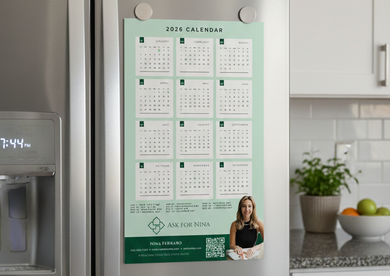
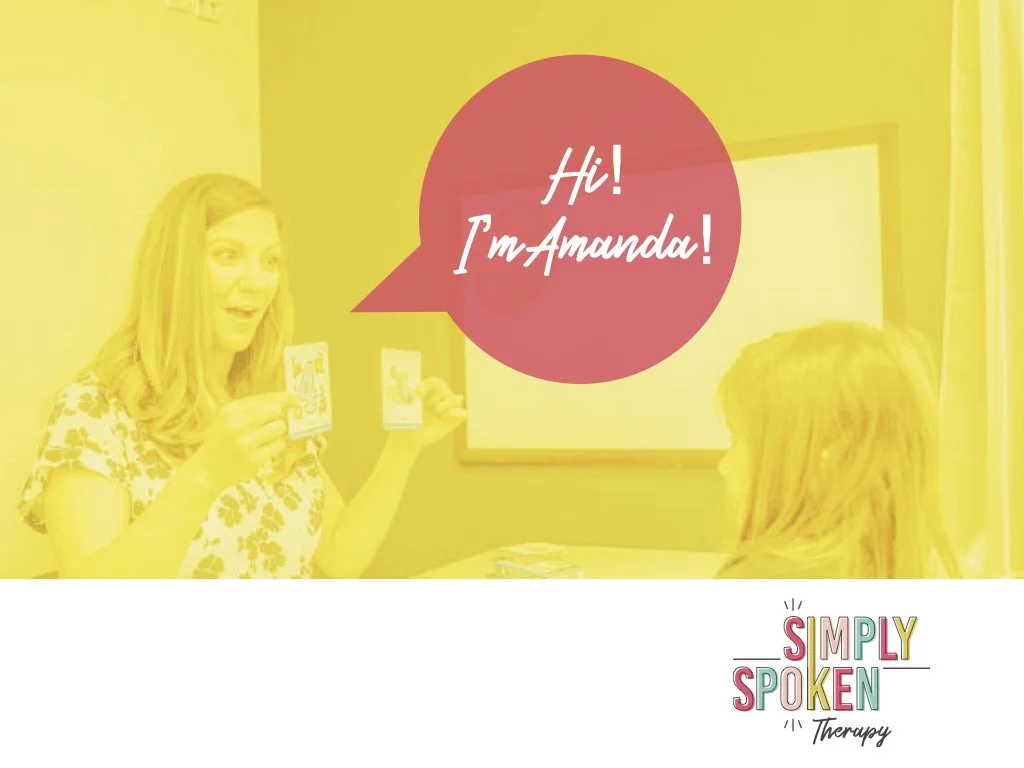
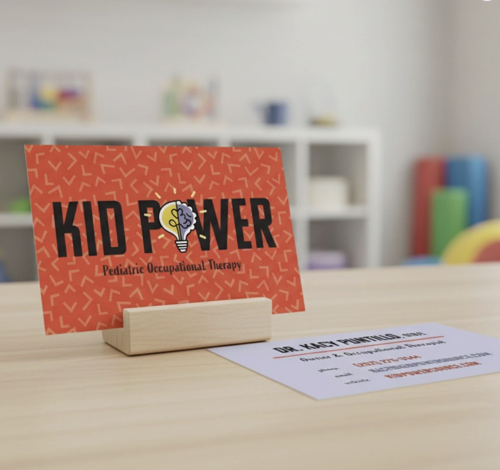
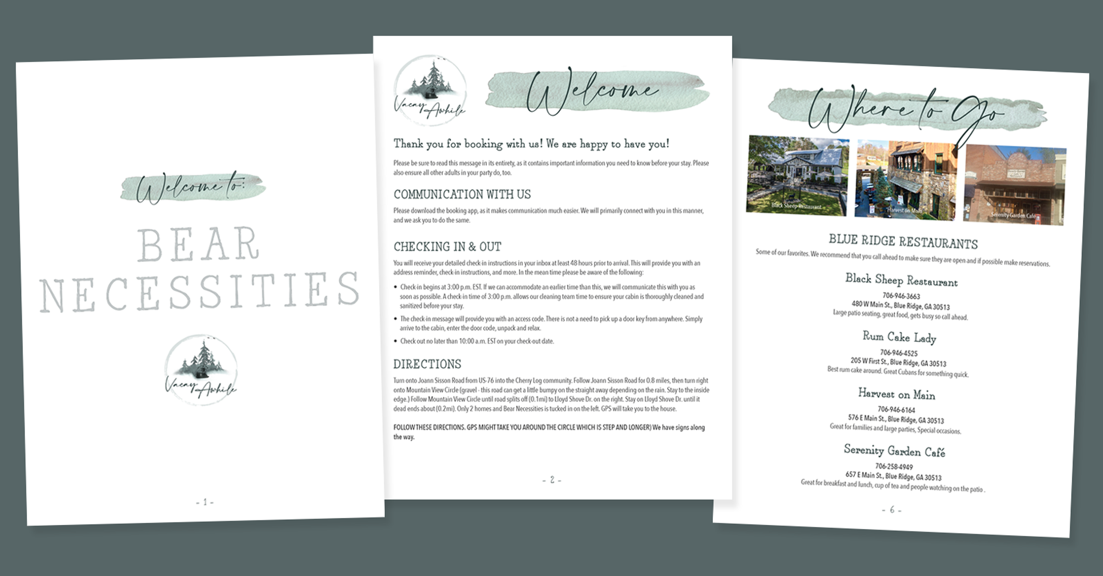
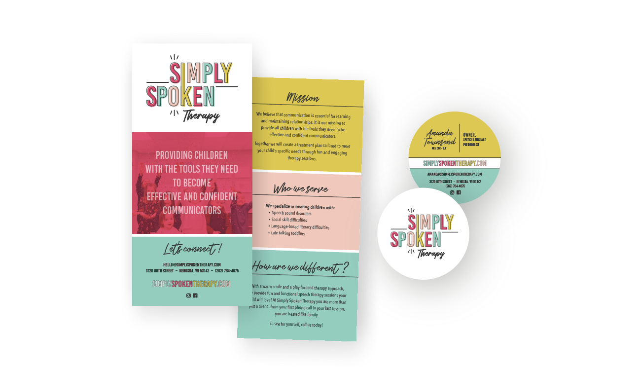
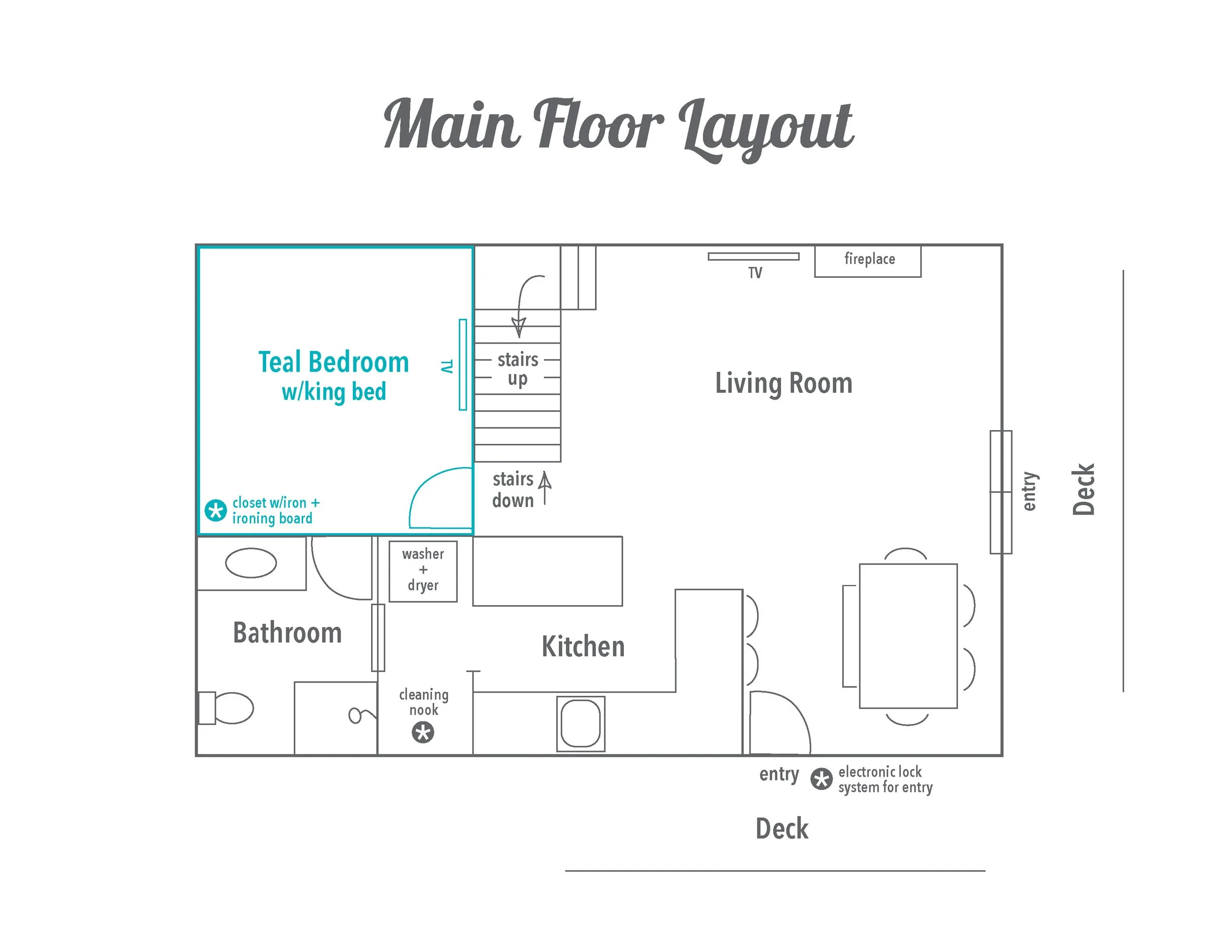
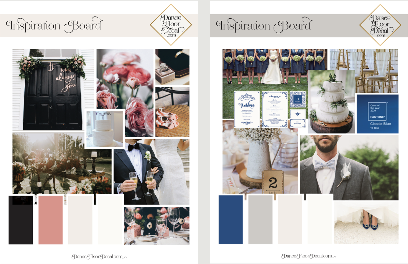
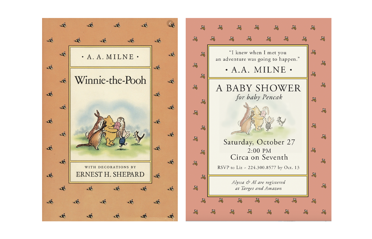
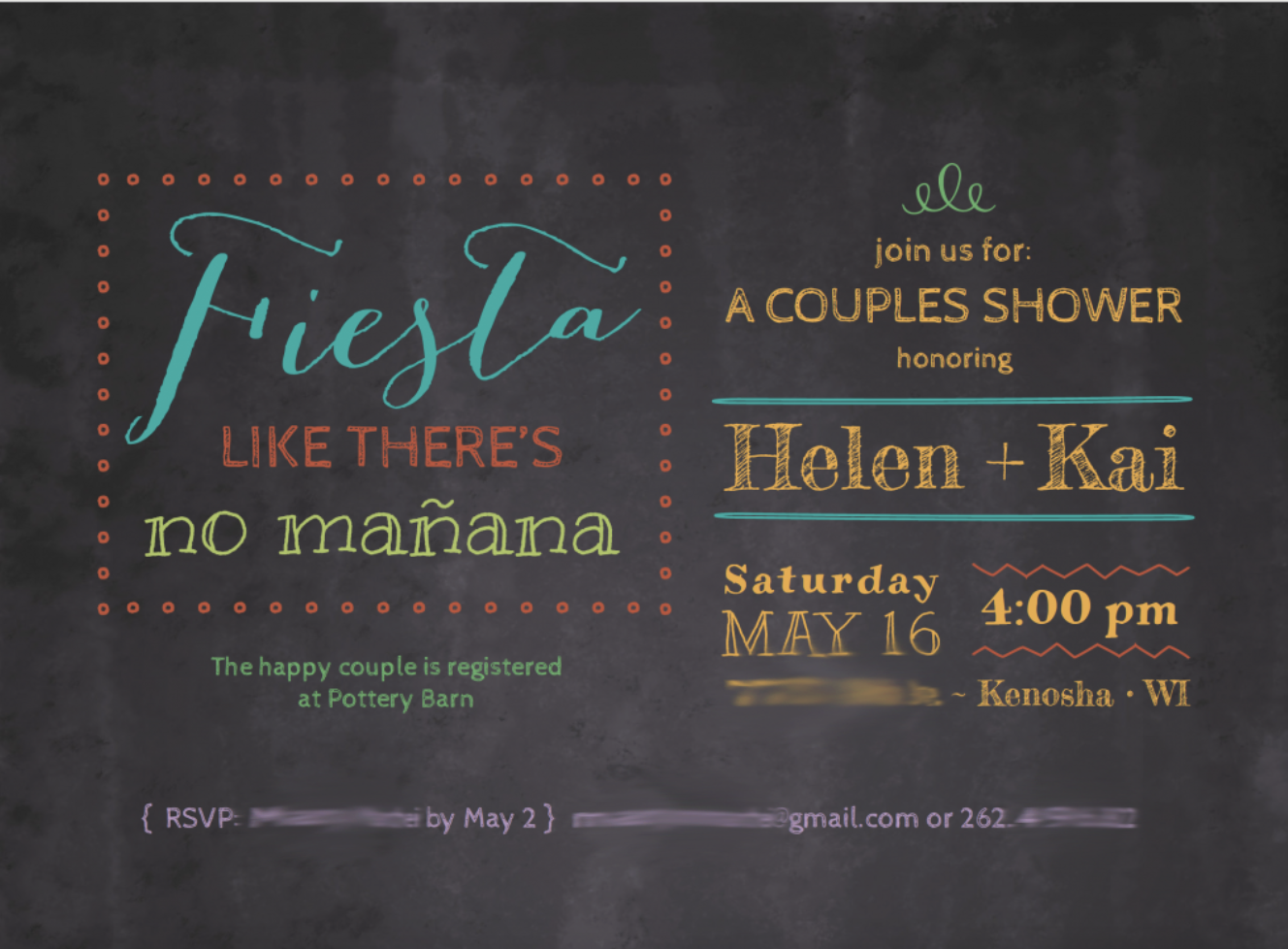
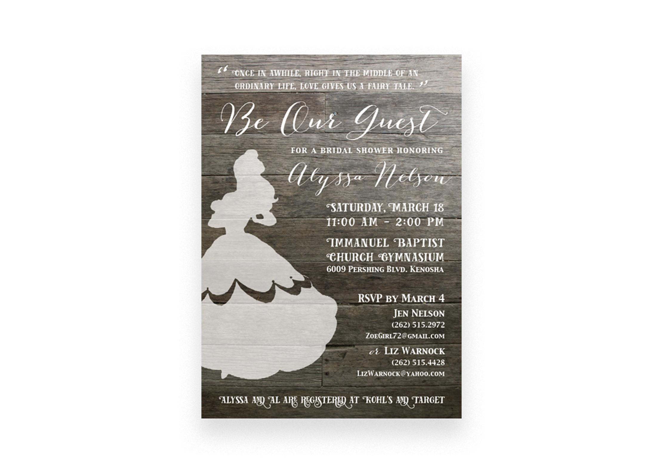
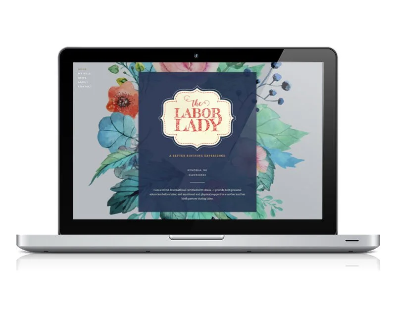
Blog Mary Manthei 5/18/26 Mary Manthei 5/18/26 The Best Brands Don’t Have to Start in a Boardroom Read More Mary Manthei 3/16/26 Mary Manthei 3/16/26 How Infographic Design Strengthens Modern Websites Read More Mary Manthei 1/29/26 Mary Manthei 1/29/26 Ask for Nina Read More Mary Manthei 1/5/26 Mary Manthei 1/5/26 Brand Spotlight: Simply Spoken Therapy Read More Mary Manthei 12/21/25 Mary Manthei 12/21/25 A different take on a financial planning logo Read More Mary Manthei 10/1/25 Mary Manthei 10/1/25 Full Circle Moment Read More Mary Manthei 6/13/22 Mary Manthei 6/13/22 Vacay Awhile, a short-term rental company Read More Mary Manthei 1/2/22 Mary Manthei 1/2/22 A Refresh for Simply Spoken Therapy Read More Mary Manthei 10/19/21 Mary Manthei 10/19/21 Lofty Dreams Read More Mary Manthei 5/4/21 Mary Manthei 5/4/21 Mood Boards Read More Mary Manthei 5/20/20 Mary Manthei 5/20/20 A Classic Tale Read More Mary Manthei 1/14/20 Mary Manthei 1/14/20 Fiesta Time Read More Mary Manthei 11/7/19 Mary Manthei 11/7/19 Belle of the Ball Read More Mary Manthei 3/12/18 Mary Manthei 3/12/18 The Labor Lady Branding Read More Mary Manthei 2/9/17 Mary Manthei 2/9/17 A Simple Save-the-Date Read More
Mary Manthei 5/18/26 Mary Manthei 5/18/26 The Best Brands Don’t Have to Start in a Boardroom Read More
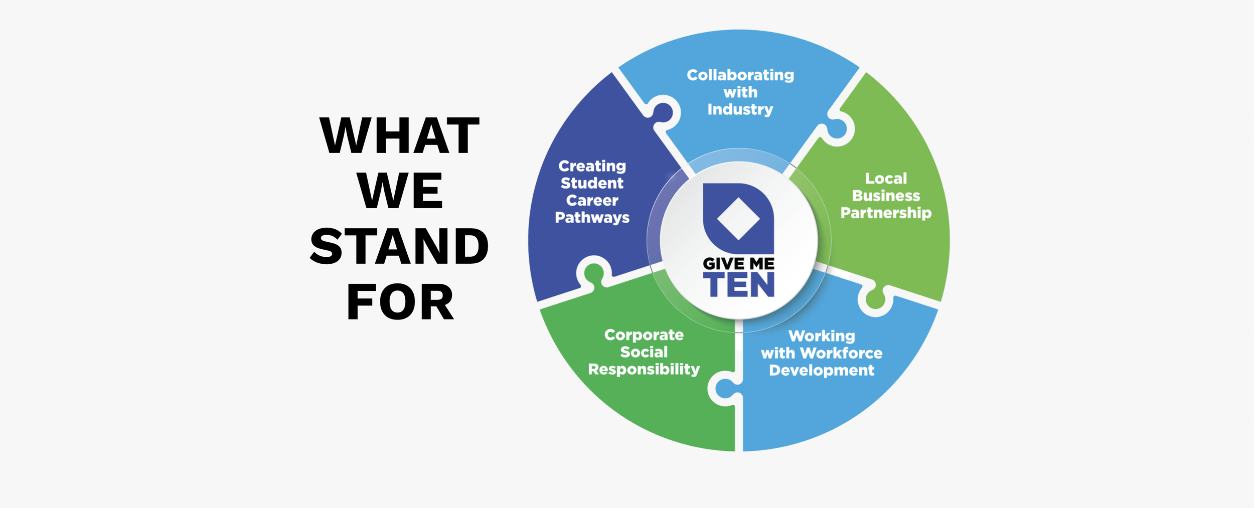
Mary Manthei 3/16/26 Mary Manthei 3/16/26 How Infographic Design Strengthens Modern Websites Read More